Savanthi Murthy
USER EXPERIENCE RESEARCHER
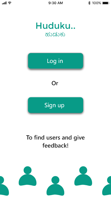
Huduku
An App to Find Users and Leave Feedback

How can user research students and startups easily find and recruit their ideal users?
Huduku is my first solo UX project. The concept was born out of a need that I identified and wanted to solve. It is designed for user researchers and helps them find and reach out to users to schedule their usability sessions. I developed both, the user and the researcher versions of the product.
My inspiration for this project came from my personal experiences while recruiting users as a student. However, I wanted to make sure that I was designing for all researchers, and not just for me. This is something that I was mindful of throughout the course of this project. The word 'Huduku (ಹುಡುಕು) means 'to search' in my native language, Kannada.
Individual Project

My Role:
User Research, Persona Generation, Wireframing, Prototype development , UX Design , Information Architecture
Tools Used:
Optimal Sort (Card-sorting), Adobe XD (Prototyping), Draw.io (Site map and user flow)
Jump to..
Research Plan
Generative Research
Online Survey
Objectives
To understand if there was a need for a product to help researchers find and recruit the right users.
As a screener survey to identify potential participants for further research.
Details
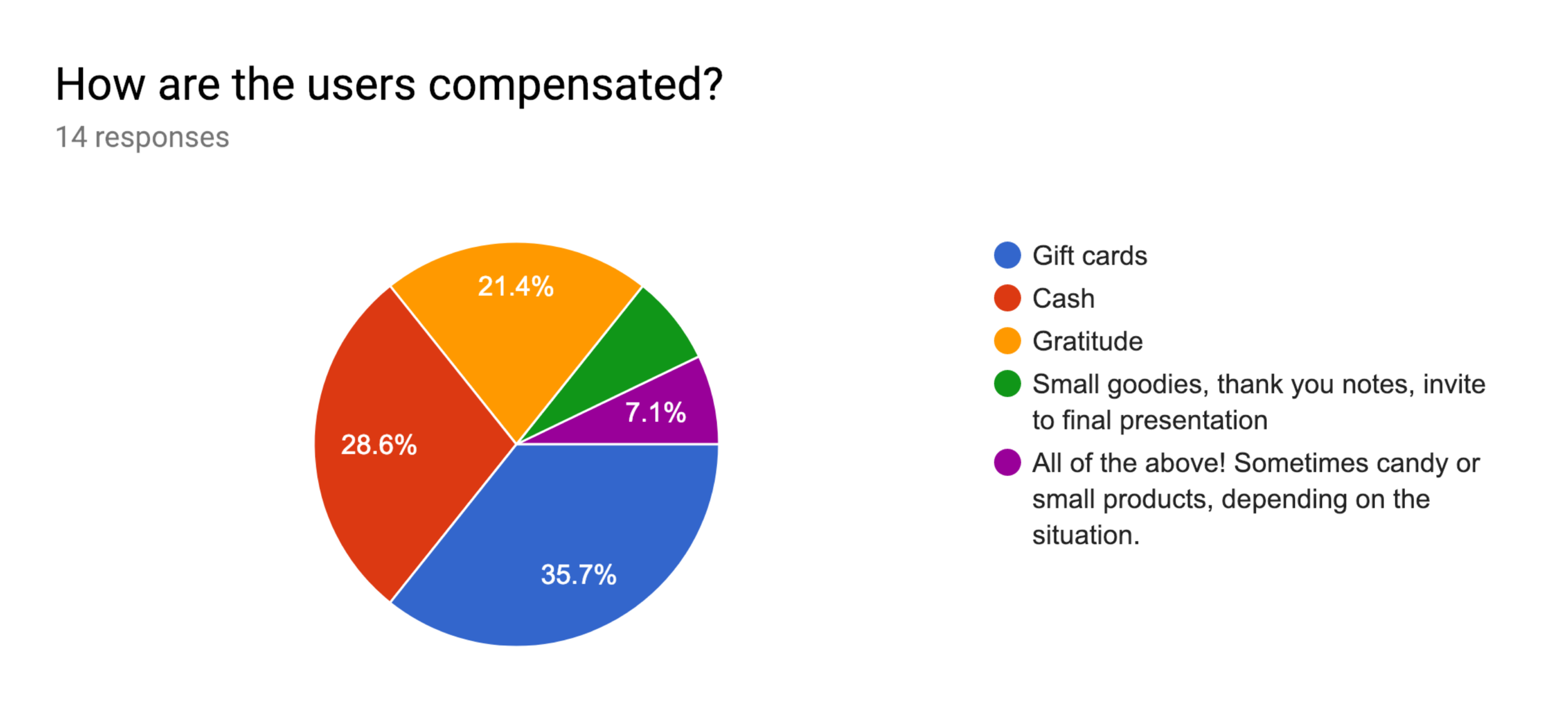
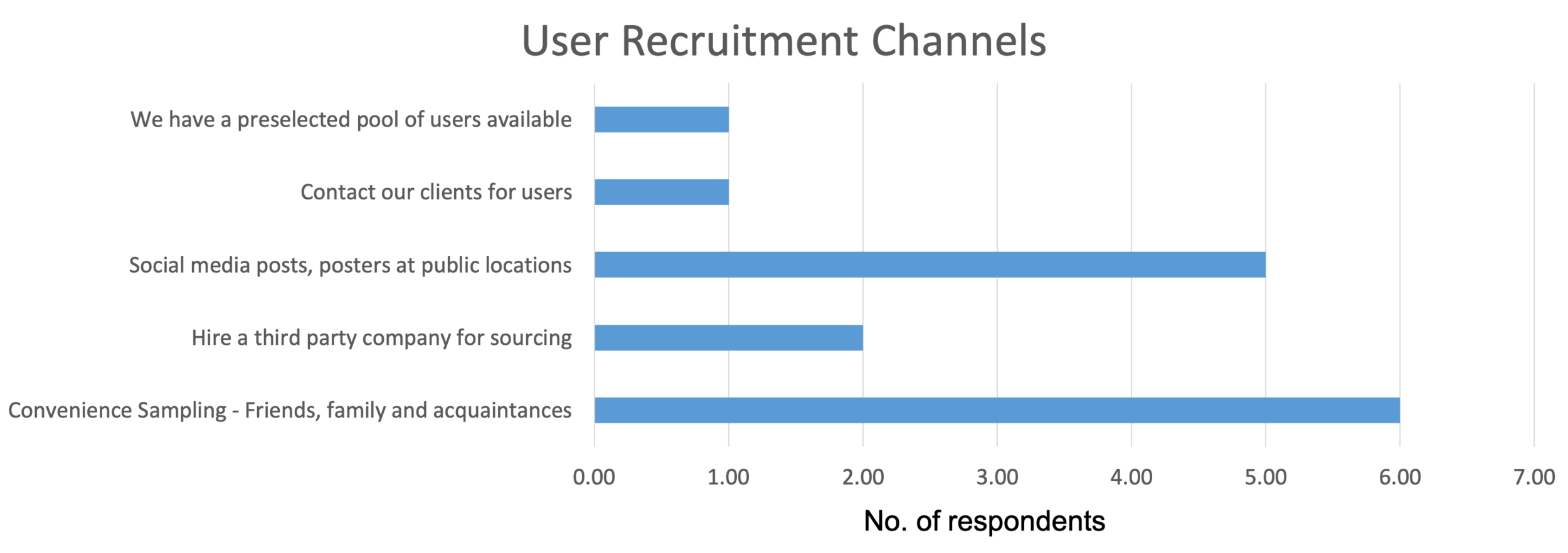
15 Researchers* completed the survey.
Respondents were asked about what parts of their job they found easy or difficult and about their recruitment methods.
*I understand that it is not possible to find generalizable results from this survey since 15 responses cannot provide statistically significant data. But, as a self-initiated solo project, I was constrained by time and resources, and this was a good way to gauge the need and find the right users for interviews.
Synthesis
The data from the survey results were compiled into charts and graphs to gain insights.

Insights
1/3rd of the respondents indicated that sourcing users is usually very hard and 4 others said that it wasn’t easy, as compared to actually conducting the sessions with users, which 3 respondents found to not be easy. 4 of these users work at startups and 3 are students. This validated the need for developing this product for researchers.
~70% of users usually recruit through convenience sampling - asking friends, responses to posters, or social media posts. This could result in biased responses, which might be okay for students who are still learning, but would impact big decisions in startups and small companies.
In-Person and Remote Interviews
Objectives
To understand the motivations behind the recruitment behavior of researchers.
To learn how they tackle challenges related to recruitment of participants.
Details
5 researchers were interviewed. These participants are either students, students with internship experience at startups or employees of small organizations.
4 of these interviews were conducted remotely.
Interviewees were asked primarily about their recruitment practices.
Synthesis
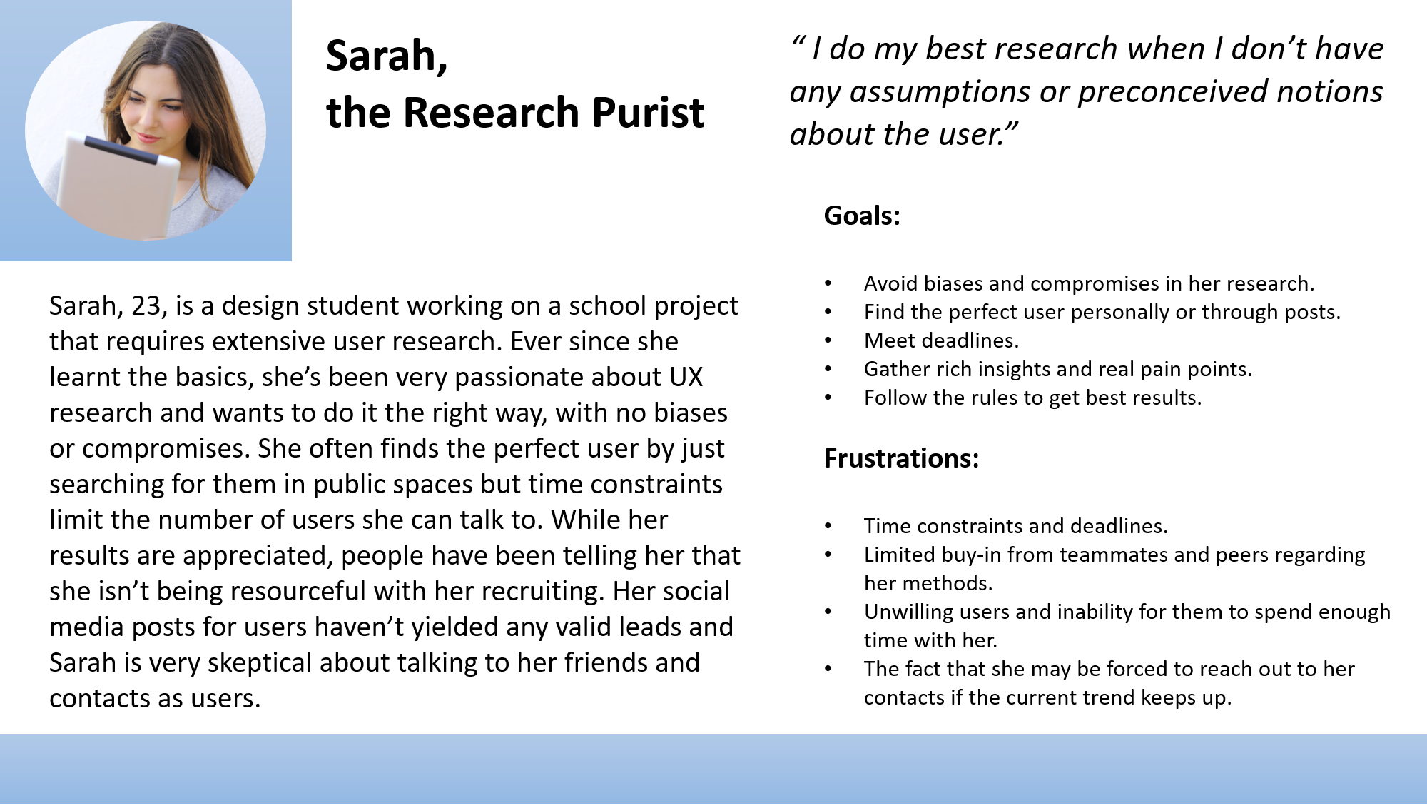
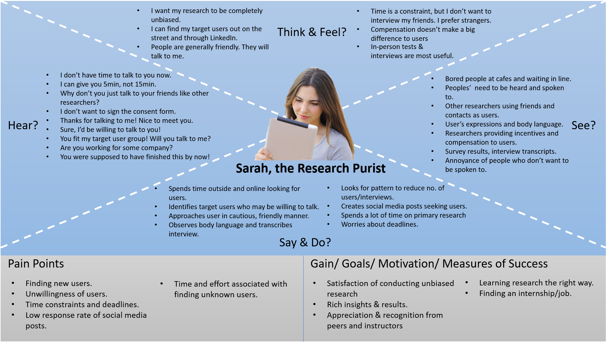
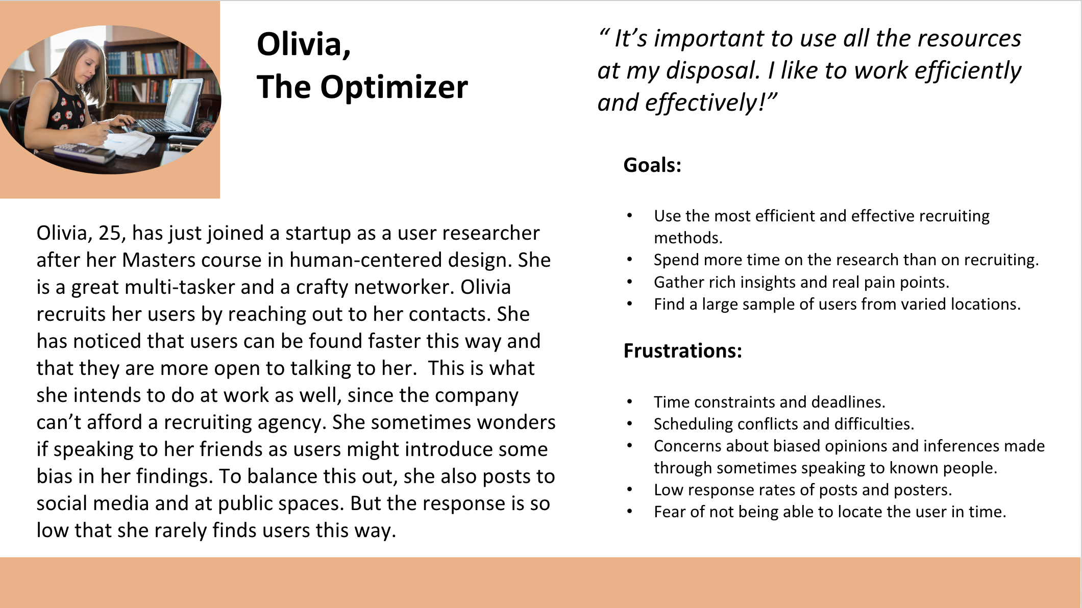
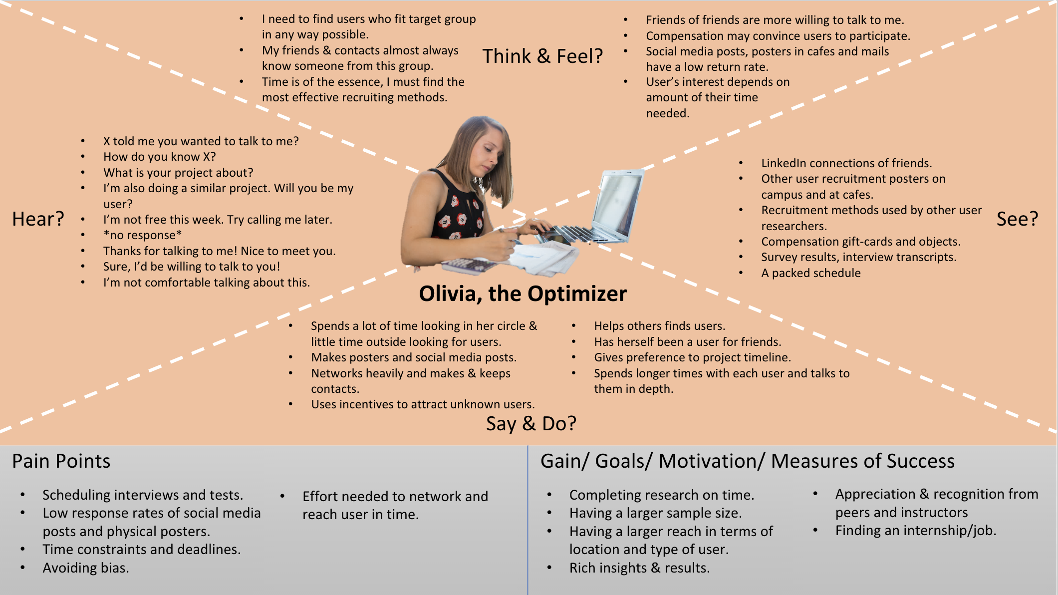
Based on my interviews with the researchers, I could find distinct recruiting beliefs and styles. I created personas and empathy maps to represent these contrasting views.
Sarah the Research Purist
Olivia the Optimizer
Insights
1
Every user researcher's first source of users were their immediate friends and any contacts who fit their target user group.
User researchers feel that reaching out to their contacts would provide users faster. Some researchers also feel that if introduced through a contact, users may be more willing to spend time to talk to them.
2
User researchers have themselves been users for other teams in the past.
They like helping out as they understand how difficult it can be to find people within the target user group. Even a text introduction has proved to be effective.
They have also helped researchers find users to test with. They are very open to spending time with other researchers and providing inputs as a user, as long as they have the time.
3
Almost all researchers mention that the response rate for posters, social media posts, chain mails or ads is very low.
However, users who do respond to these posts generally follow through and are committed to the study.
4
Scheduling the research session can be more challenging than finding the right user.
Just finding the right user who matches the criteria isn’t enough. As a result, some researchers have missed the opportunity to interview ideal users who were willing to talk to them.
5
Researchers find creative methods of compensation for users if they have insufficient funds to buy gift-cards.
Knowing about the impact that the solution could have or the magnitude of the problem might be motivation enough for some users. Observing users and just talking to them when they seem to be waiting for something, or bored has also been effective for some researchers.
6
The difficulty in finding users depends on the researcher’s environment as well as the type of users they are looking for.
Students say that they have access to students and millennials but find it difficult to find users if they don’t fall under these categories. One interviewee mentioned that it’s particularly difficult to find users who are physically or mentally challenged. Researchers easily find the type of users who they are familiar with or have frequent contact with.
Based on these findings, I decided to make an app to find and recruit participants, where researchers and their friends could create accounts, leading to a pool of different participants who are accessible for various projects.
All the people registered on Huduku, whether researchers or their friends, will automatically form a part of the pool of participants accessible for studies. Researchers can add filters and search to find participants who fit their target group.
Concept Development and Information Architecture
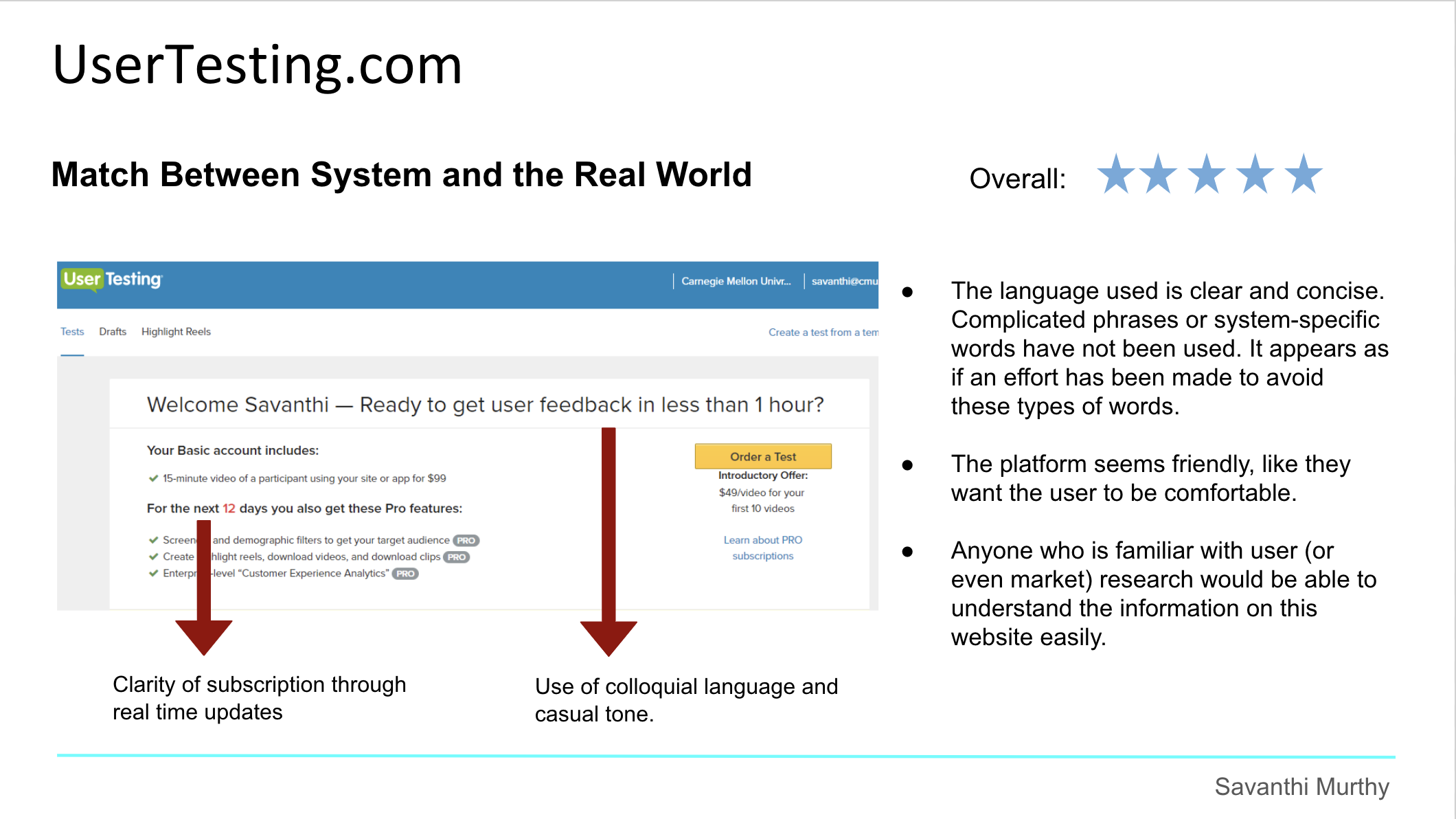
Heuristic Analysis of Competitors’ Products
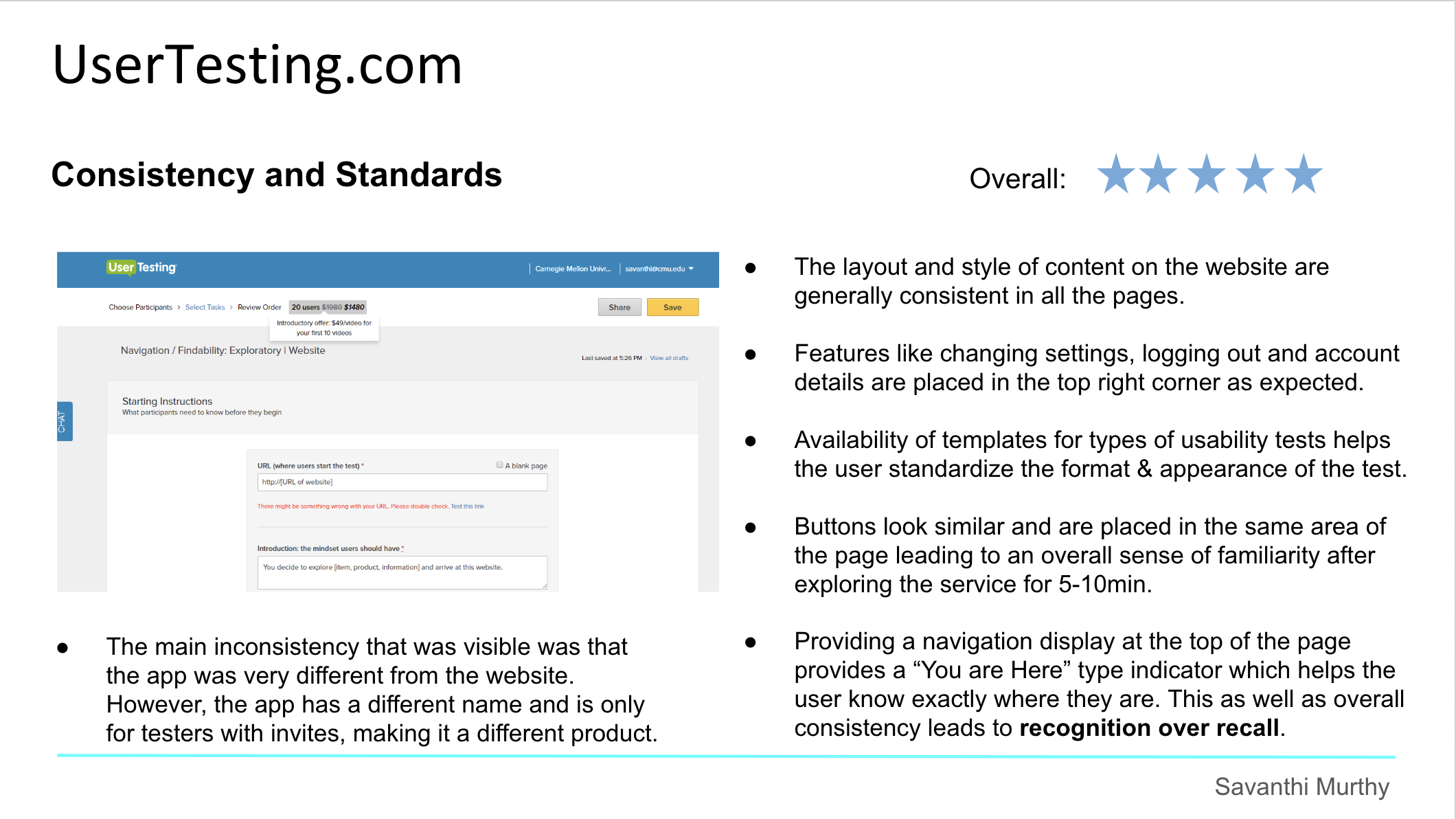
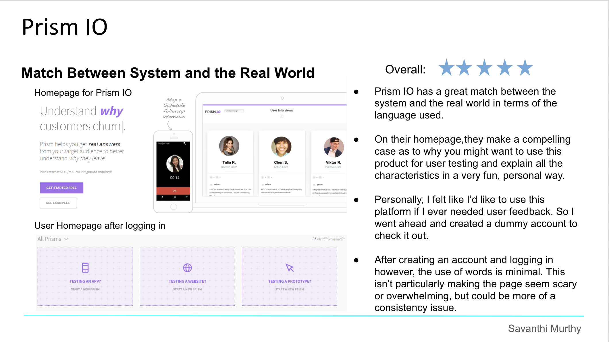
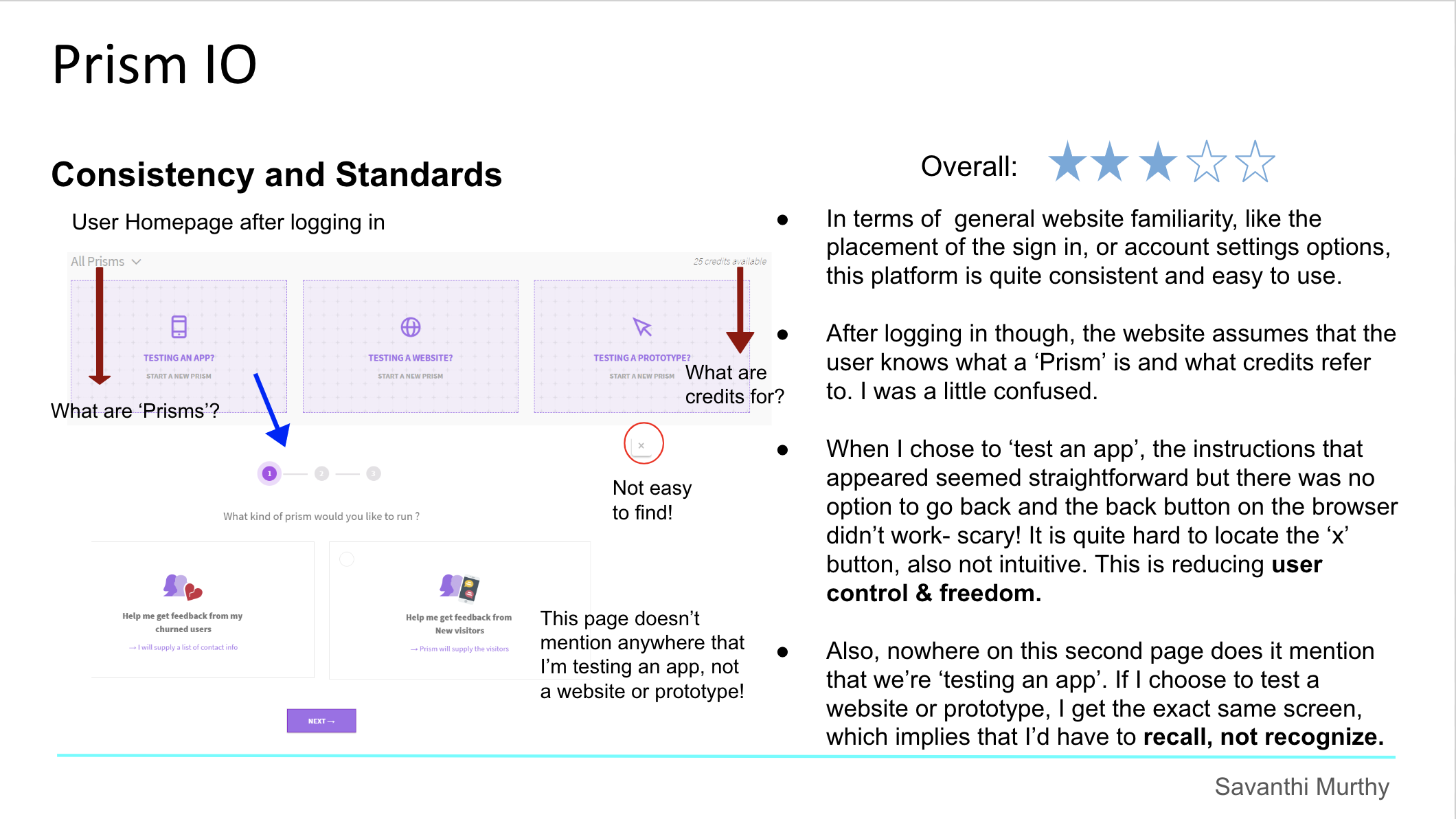
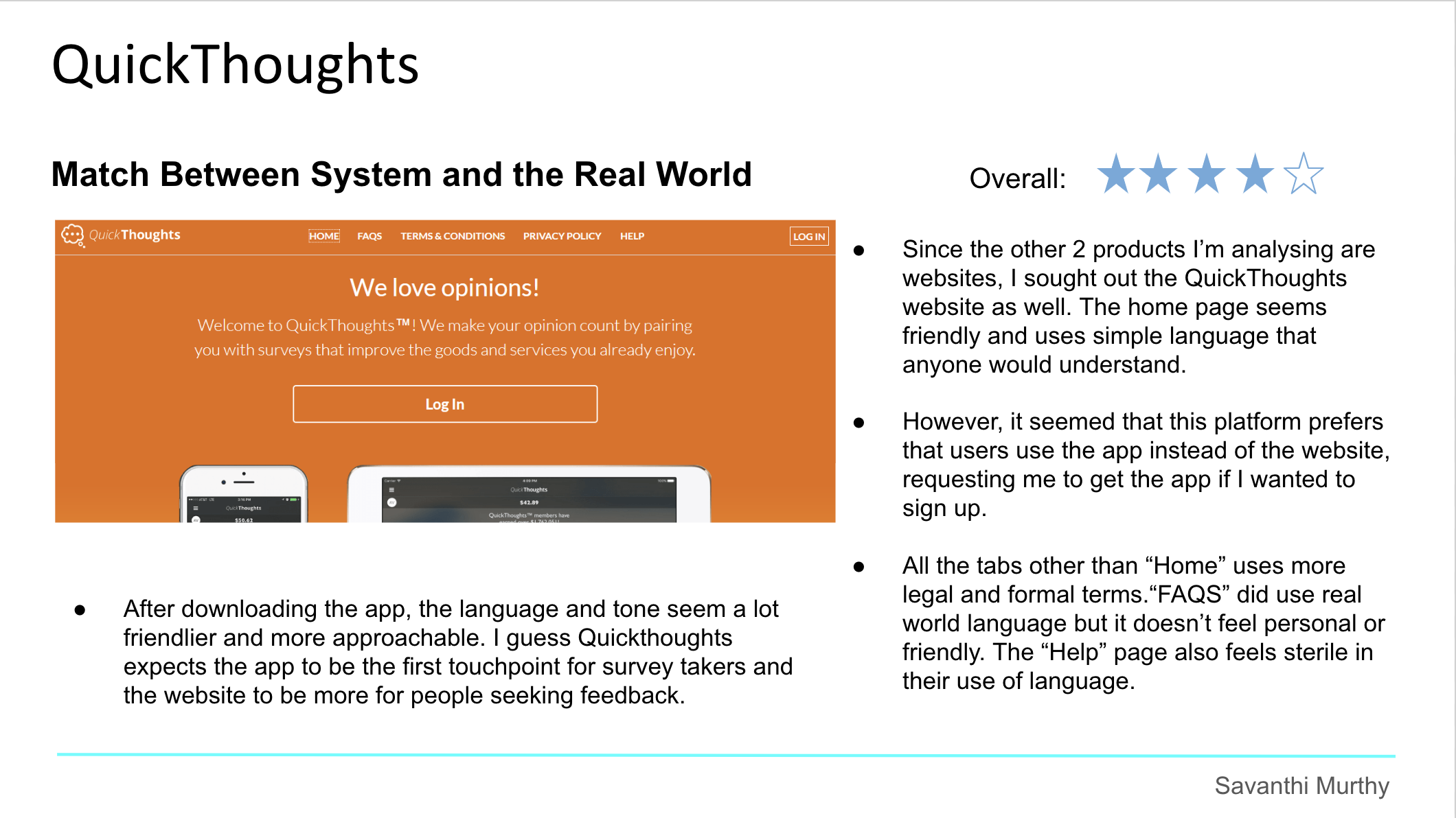
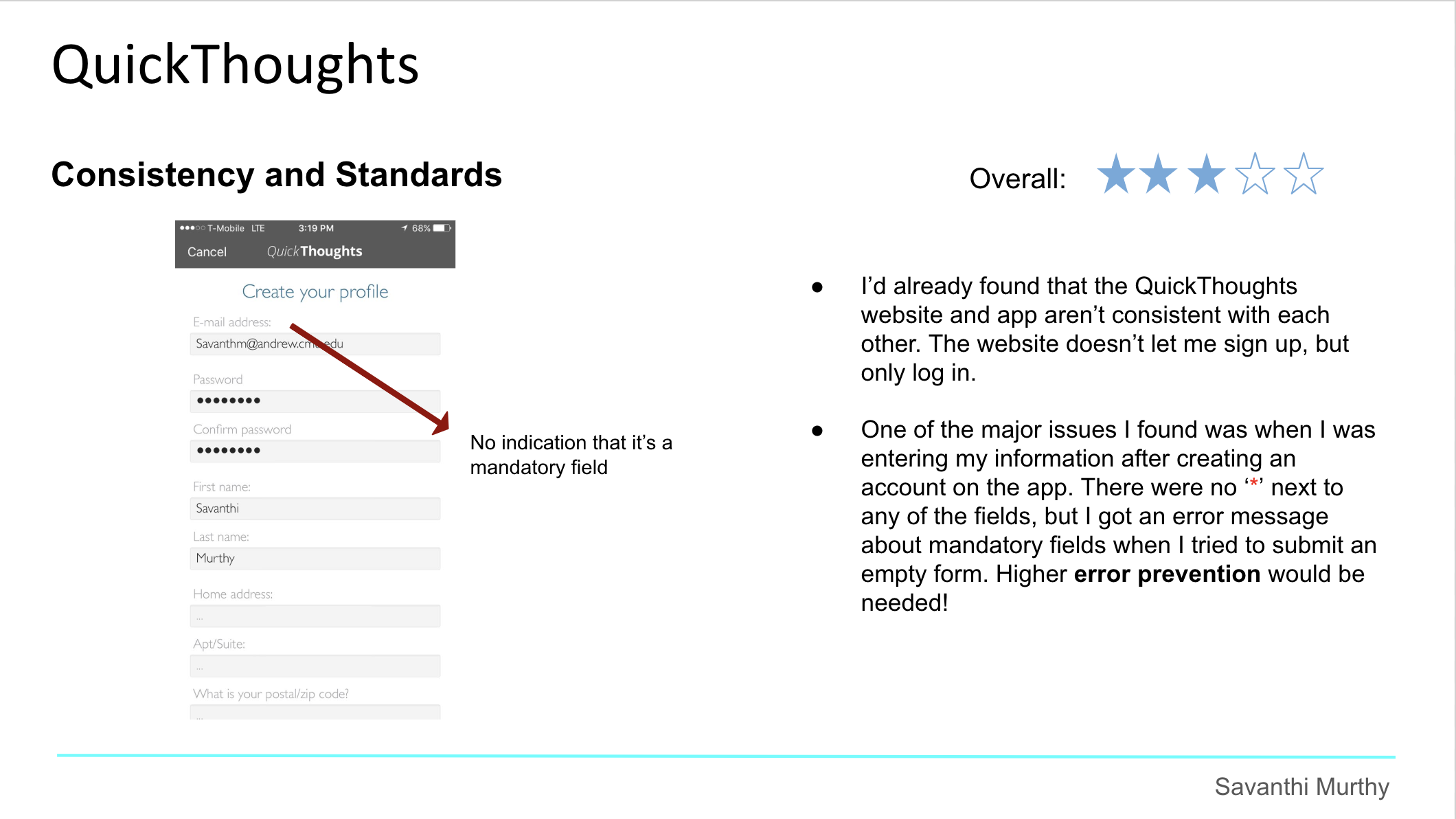
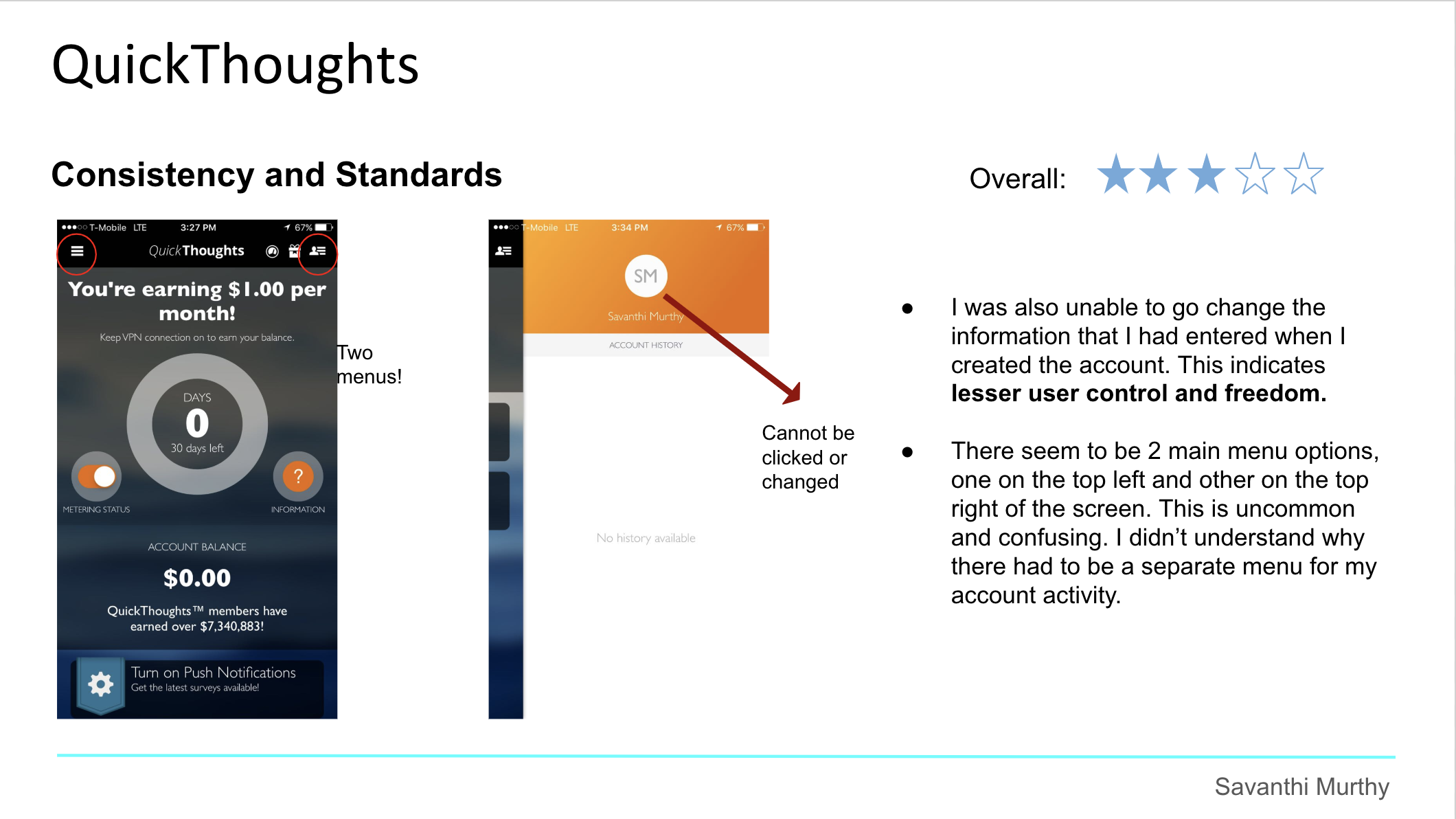
As soon as the nature of Huduku had been finalized, I wanted to learn more about products that already existed in this space, and about how they addressed similar issues faced by their users.
I chose to analyze Usertesting.com, Prism IO, and Quickthoughts against these 2 heuristics:
Match between system and real world
Consistency and standards
since I felt that these represented the most essential characteristics of such a service. But, as I went through these websites, I started finding issues that corresponded to the other heuristics as well. These have been highlighted too.
MVP Features
Next, I created user stories for Huduku and identified the features that I should develop for a minimum viable version.
My user stories can be accessed here. I focused on the most essential stories and shortlisted these features for the MVP:
Sign up/ Sign in for Researchers and Users (or as both)
Basic profile builder for researcher and user
Researcher populates their calendar (or imports calendar)
Researcher recommends contacts to join the app
Search feature for researchers to find users based on tags/ categories
Researcher sends invites to the user
User can access view researcher's profile and schedule an appointment (like Mixmax)
User and Researcher can rate each other (or maybe give comments)
Card-Sorting
Objectives
To organize the right content in the right way across user and researcher versions of the app.
To ensure that the information on the app was organized in a way to increase ease of use and reduce confusion.
Details
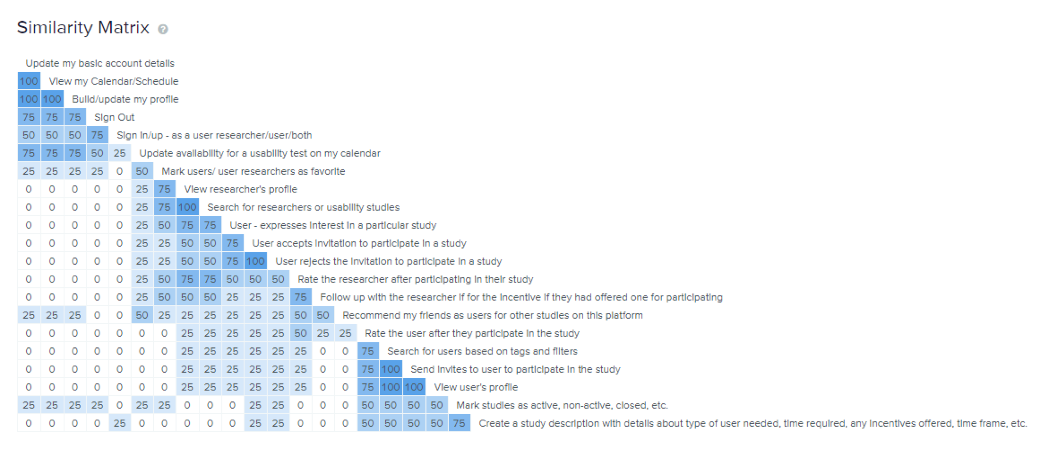
The card-sorting was conducted remotely on OptimalSort.
5 Researchers participated in the session.
Participants were asked to group app functions into menus or hierarchies that they found most logical.
The results provided by OptimalSort showed groups made by the users, a similarity matrix to show how often pairs of cards were grouped together, and a dendrogram showing possible groups that could be created based on the participant responses.
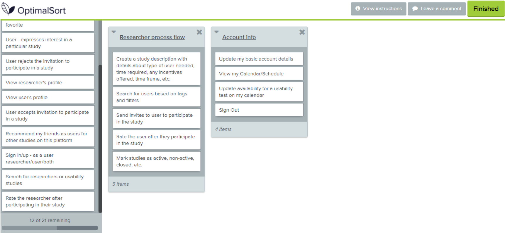
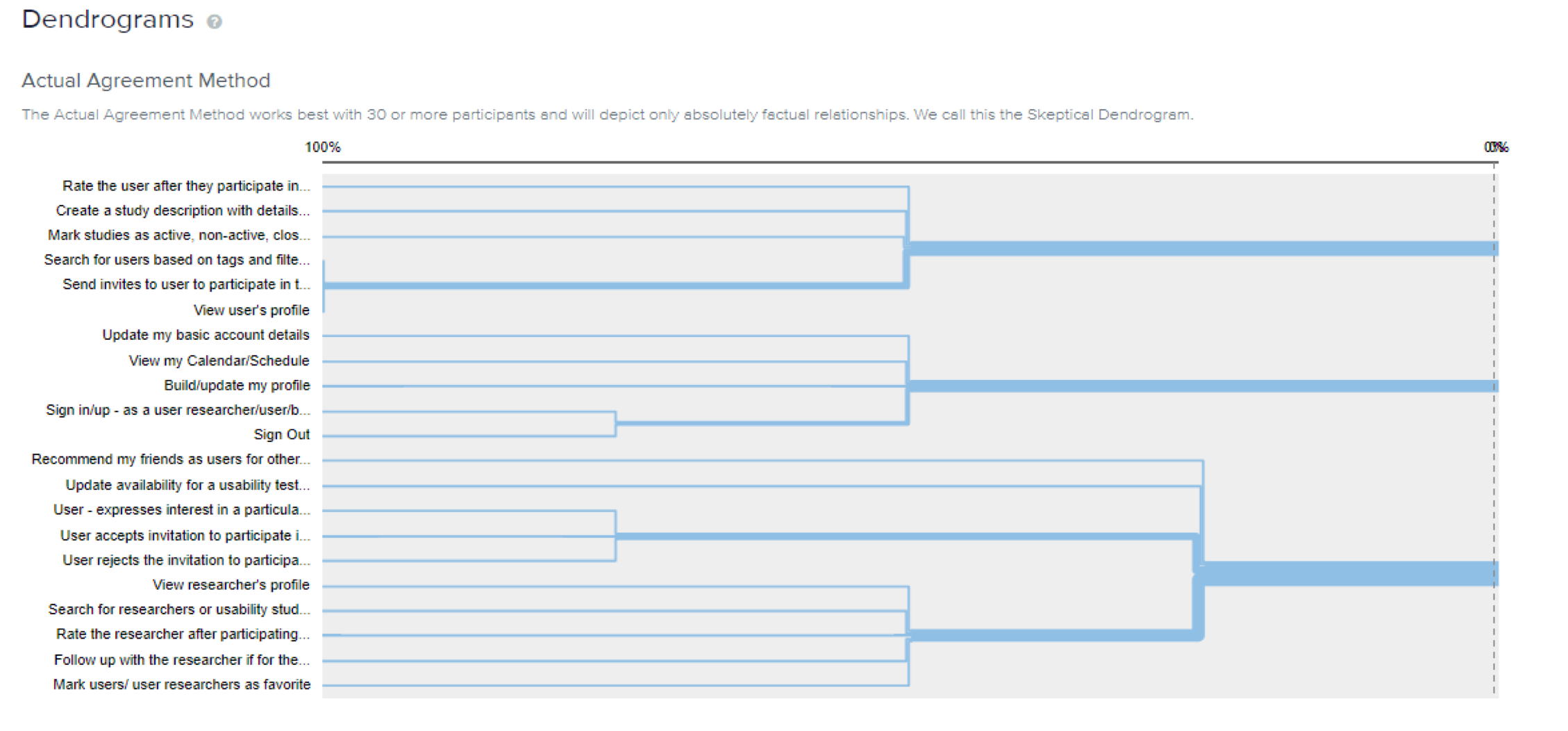
Insights
All participants created 5 different categories and included all the cards among these.
All the users created an ‘Account Management’ or ‘Housekeeping’ category for tasks such as updating account details, updating availability and signing in/out.
3 users specifically created a category for the flow or process for tasks like creating and posting a study, searching for and inviting users.
Researchers preferred that user activities and user researcher activities be grouped in separate categories even though the same person may be registered in both these capacities.
After this previous insight, I spoke to the participants and realized that some cards that I had designed may not have been ideal/relevant for this study - specifically the ‘Mark users/ user researchers as favorite’ card.
Information Architecture
Based on my findings from the card sort, I developed a sitemap for Huduku.
From the sitemap, I generated a user flow diagram for the combined experience of the user and the researcher.
Designing Huduku
Huduku was developed in 3 iterations.
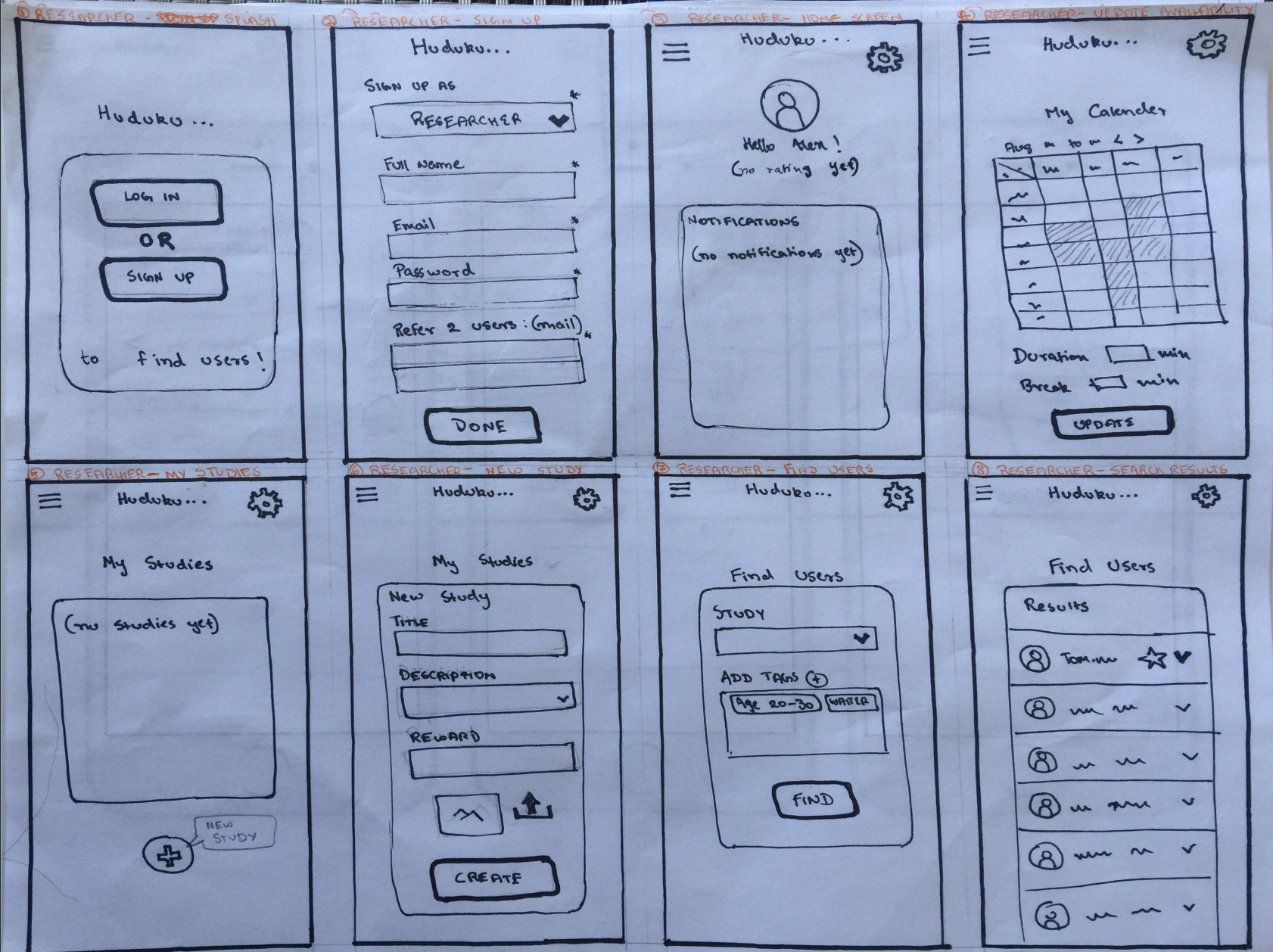
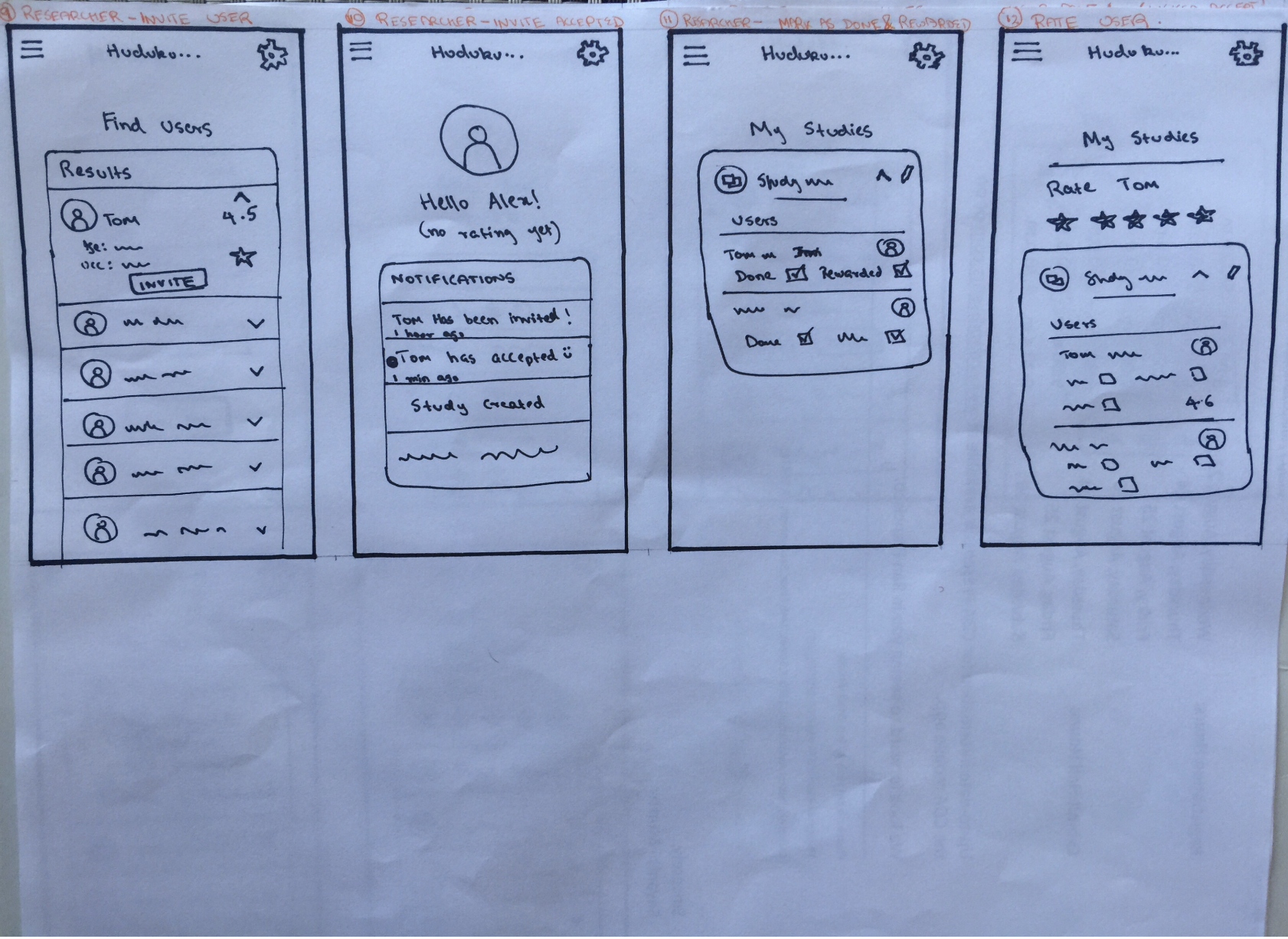
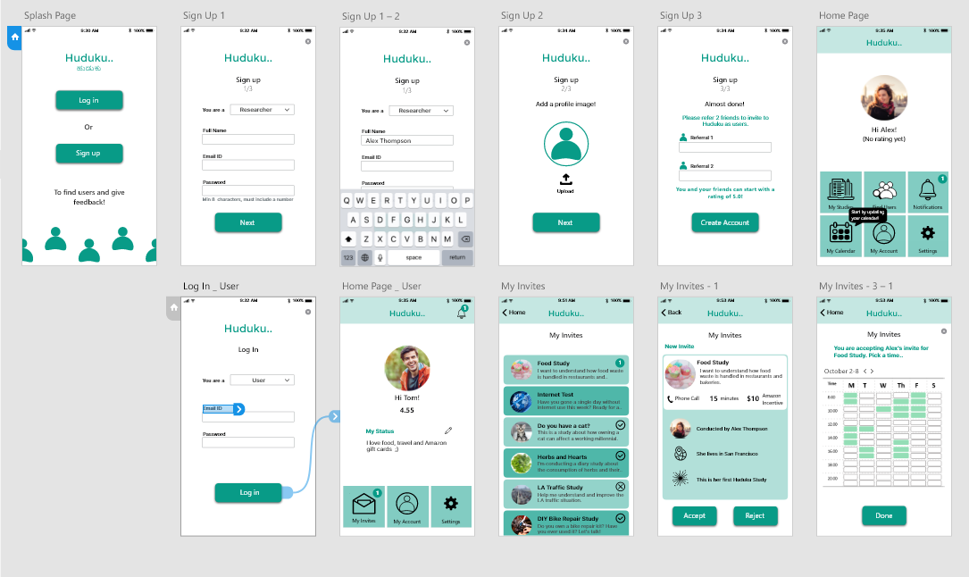
Iteration 1 : Paper prototypes
Researcher Version
Participant Version
Feedback
An informal feedback session was conducted with 2 researchers and 1 non-researcher to refine parts of the design and flow. They were asked to go through the flow and tell me what they felt about the experience. They understood the basic concept, but without a detailed flow and process, they were not able to comment on the experience particularly. They did not suggest any major changes to the concept, so I went on to develop the wireframes.
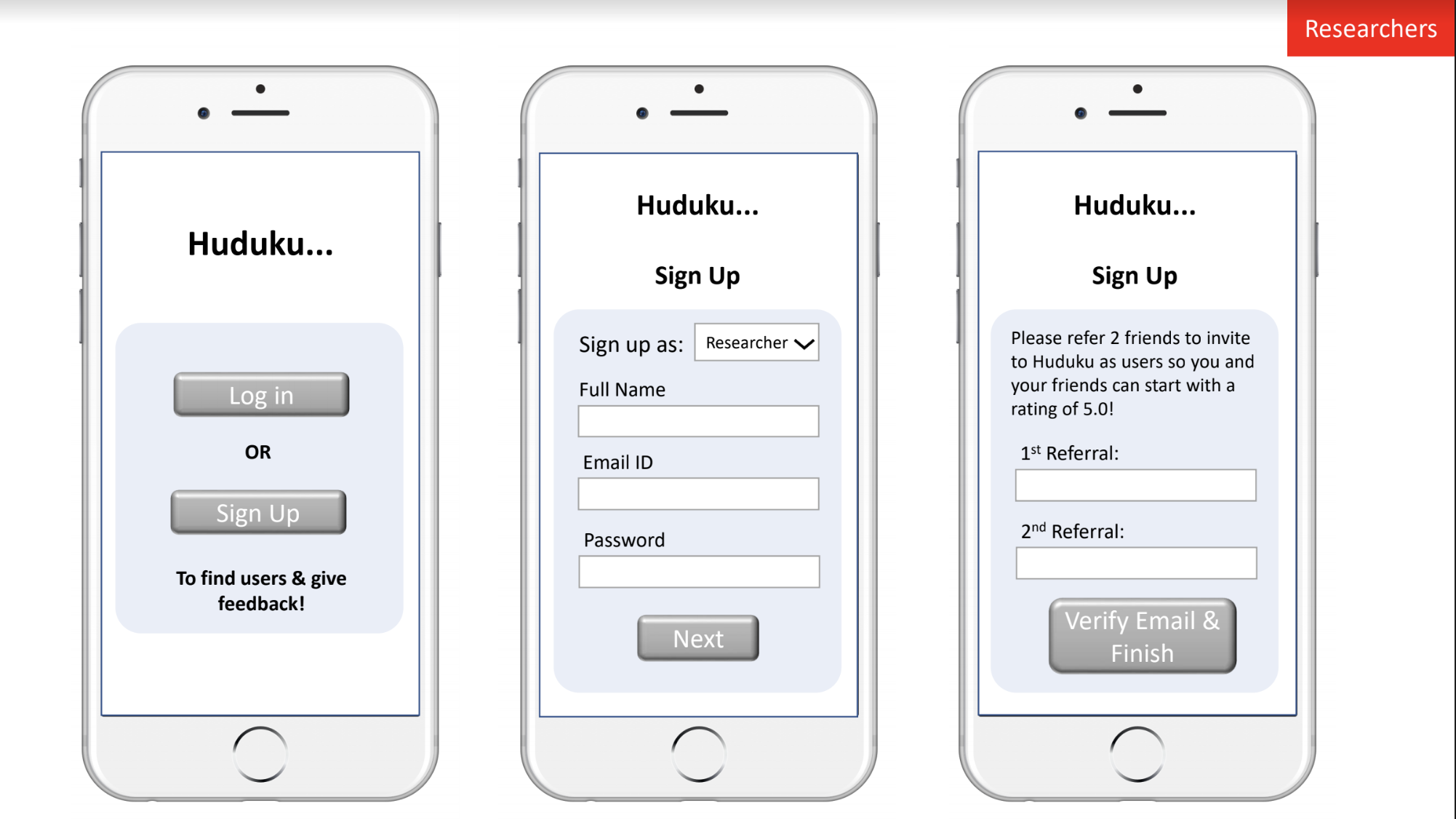
Iteration 2: Wireframes
I refined the design of my paper prototype and added more detail in each screen while developing the wireframes. I also added more screens to clarify the flow and process of the app.
Researcher Version
Participant Version
Feedback
Another informal feedback session was conducted with 2 other researchers, who weren’t involved in the previous session. This is what they suggested:
Using real text instead of placeholder text (or gibberish!) would make the experience more genuine.
The app may have a steep learning curve, especially to users who have registered as participants, since this whole process could be new for them.
Iteration 3: Interactive prototype
Based on the feedback from the wireframes, I added actual text that users might see on all the screens. I also incorporated a tutorial feature for new users, where speech boxes would appear on the app to walk them through the process.
I wanted to keep the UI simple, and chose a 2 color scheme (black and turquoise) with a clean white background. I wanted the users to be able to concentrate on the processes without getting lost in the visual aspect of the app.
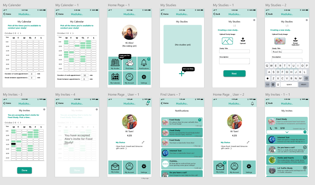
The prototype was made on Adobe XD, and I used the IoS package that was available for it. Here are some of the screens that I designed for Huduku:
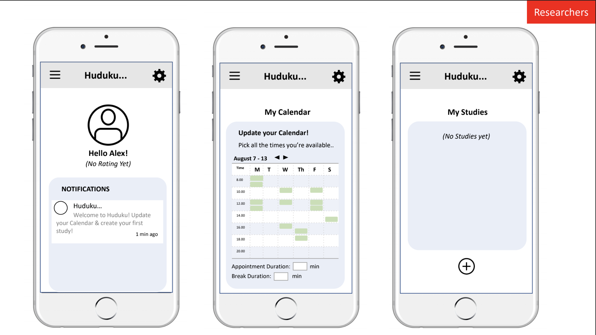
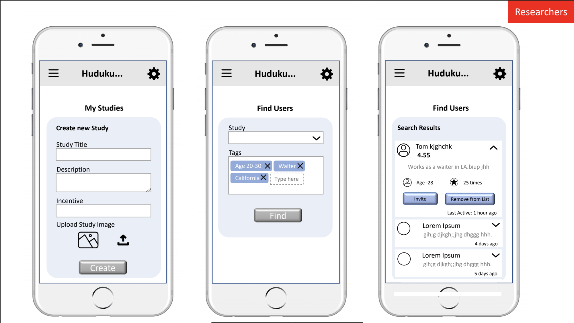
Researcher Version
What does Huduku do?
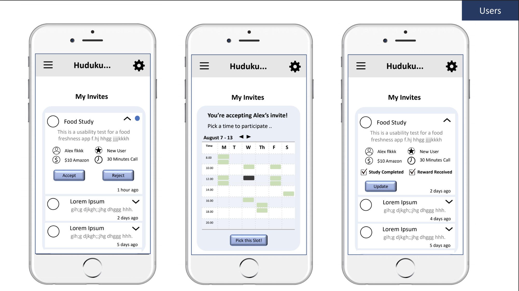
It provides a platform for researchers to create a page for their studies with a title and description, as well as details about time commitment, format, incentive etc., so the users understand what it's about.
The user researcher can specify various 'tags' to search for their exact user base.
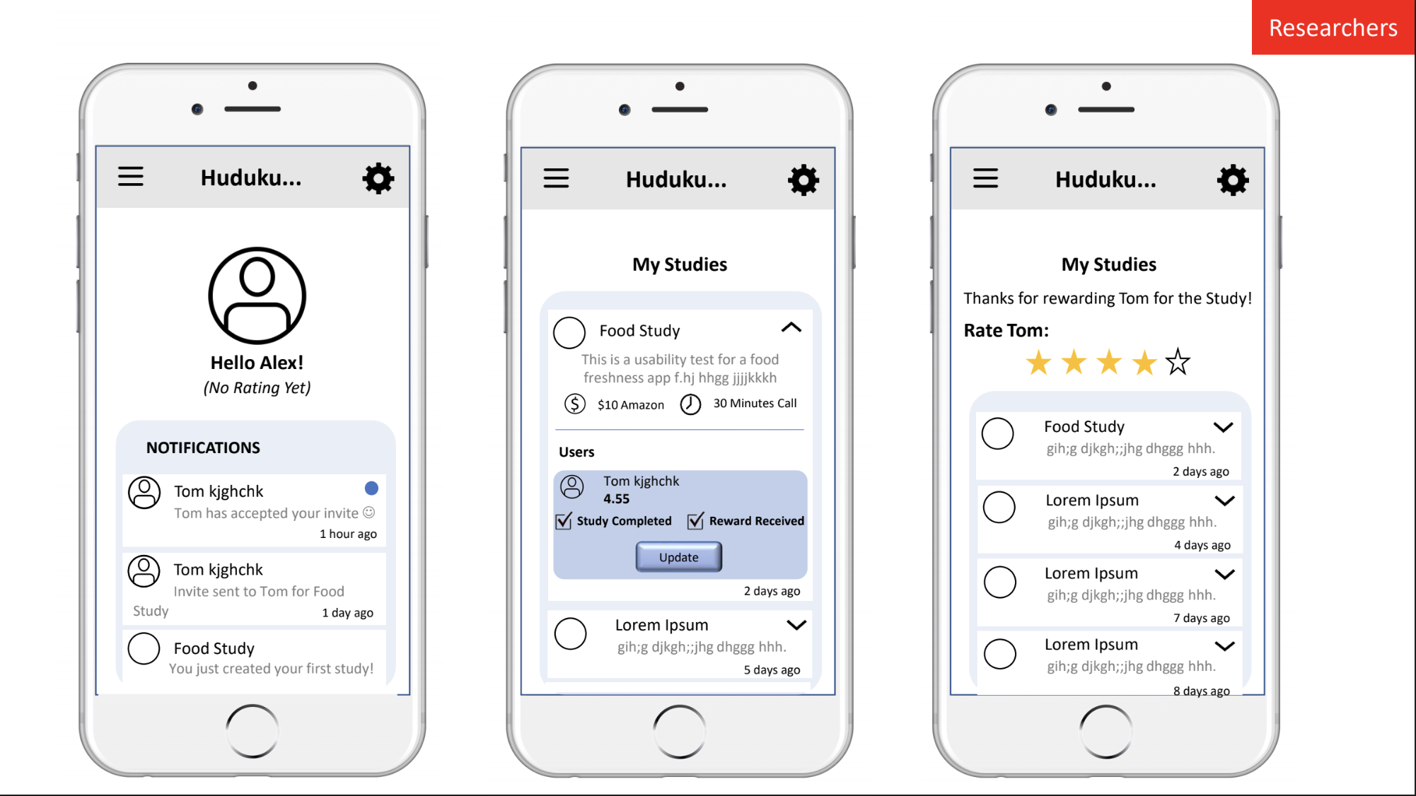
The researcher can invite the users of their choice from their search results to participate in their study.
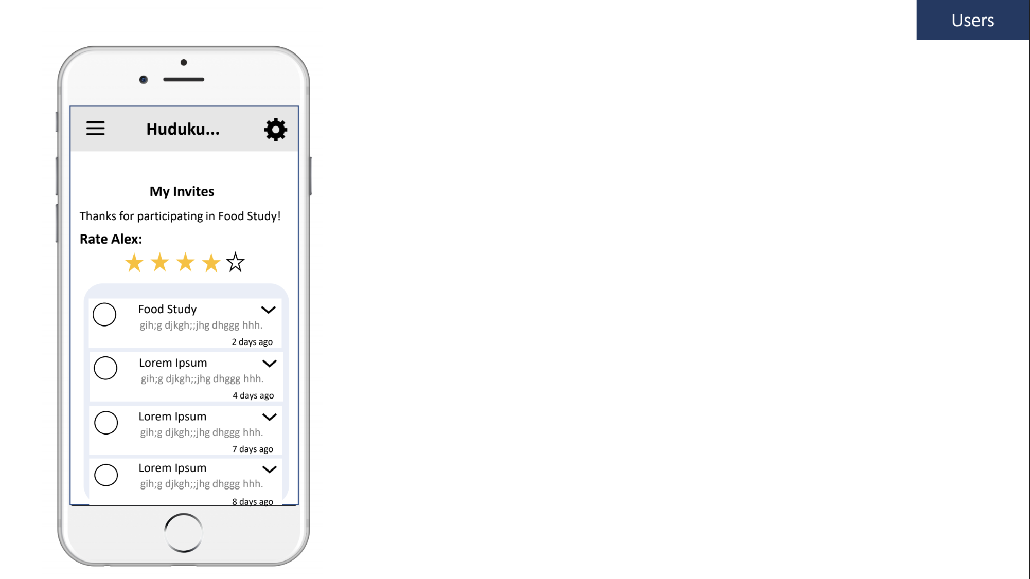
They can rate the user as well!
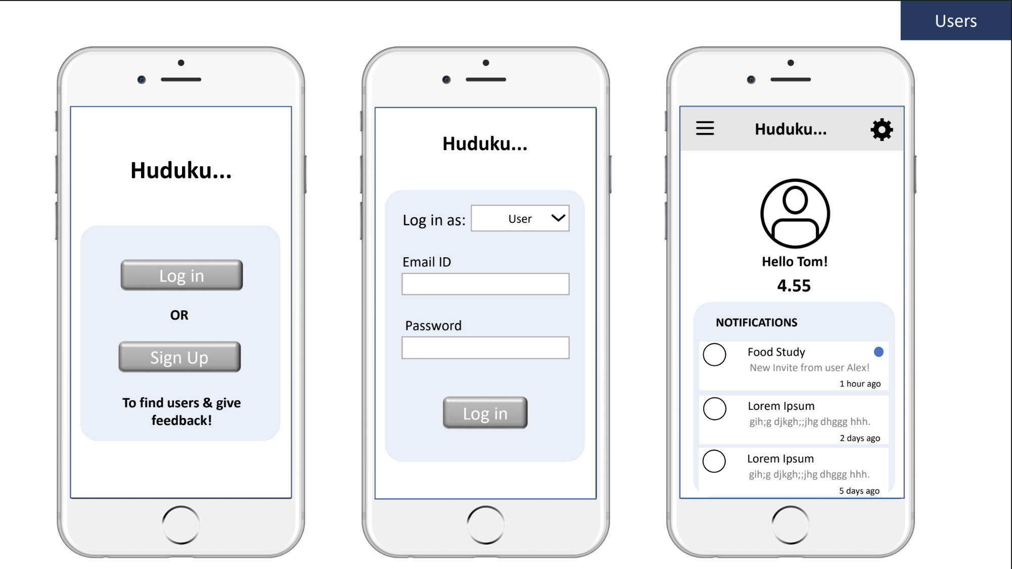
The users can choose to accept or reject invites.
They can pick time slots of their choice from the researcher's available times in their schedule.
They can confirm that the study was conducted and the incentive received.
They can also rate the researcher!
You can try out the Adobe XD prototype by clicking on the image below!
Some things to keep in mind..
Huduku is not involved in actually conducting the test. It just matches the user and researcher and schedules the session.
It also doesn't verify the incentive being sent or received. Users and Researchers themselves moderate this through ratings and reviews.
Evaluative Research
Think-Aloud Usability Testing
Objectives
To evaluate the flow and usability of Huduku with researchers and non-researchers.
To use their feedback to refine and further develop the concept.
Details
I spoke to 4 users totally, 2 for the user flow and the others for the researcher flow. All these tests were conducted remotely.
I created a different set of tasks for both the roles, based on exploring and going through the flow of creating or participating in a study. I asked them to think aloud as they went through these tasks.
The interview protocol for this session can be found here.
Feedback from Users
Overall, users were very comfortable with the app flow and construction. They did feel that the homepage construction was a little unconventional with tiles being used to represent the various features, but still felt it was simple and easy to understand.
I was very happy the researchers I tested with understood that the pop-ups suggesting their next action was a tutorial because they’d just signed up and wouldn’t appear every time.
One of the 4 users I tested with noticed a typo that I had made on one of the screens and it bothered him a lot. The other users did not notice it at all. I’d like to go through all the language I’ve used to prevent this.
One of the researchers raised an important concern. They wanted to see example ‘tags’, or categories of users, while searching for users on the app. They wanted to know if there was some format in which they should be typing the age to get the the correct search results. I think example tags are a great idea, particularly for new users!
Reflections
“I was initially intimidated about testing with user researchers as users. But it was actually a lot of fun!”
As a new grad in the user research space, I felt that testing with other researchers as users would be intimidating, and that the stakes are high! But I found nothing but insightful conversations and tons of support from everyone. I loved the experience overall.
Immediately after this project, I was offered a role at Prism Labs Inc. as their sole UX practitioner! This is actually one of the companies that I conducted the heuristic analysis for as a competitor during this project. I had the opportunity to work on all the issues on their page that I have highlighted previously, and to improve their website and their product offering to clients.
It was quite difficult to prevent myself from designing for myself, since I actually formed a part of the user group in this project. At the beginning and end of each of the research and design sessions, I checked in with myself and made sure that I was thinking objectively and going ahead purely based on my findings. Working all by myself was also a challenge in this regard.
Overall, I feel that I should have focused more on the UI elements of the Huduku app to make it more visually appealing to users. I would like to reduce the number of fonts used to decrease the variability in appearance and pick brighter colors to make the app more exciting.